Observed: Rail Departure Boards
Platforms 13 and 14 at Manchester Piccadilly have their own lore. Most of it isn't flattering! But there's something there I noticed heading home on Christmas Eve.
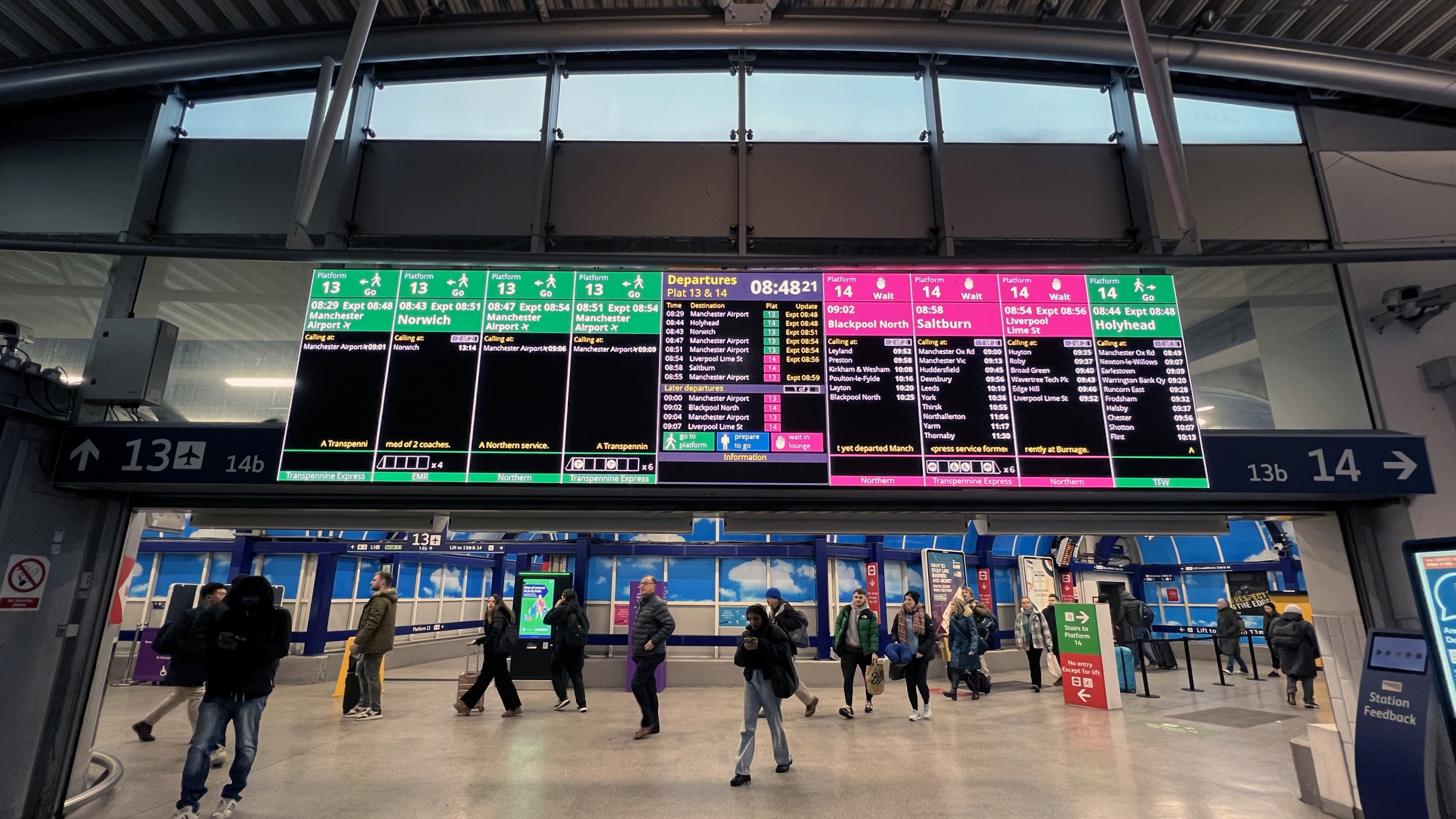
I've seen it dozens of times without really thinking about it, but given it was cold out, I paused in the "lounge" before taking the stairs down to the platform and checked the departures information screen.
Looking up I could tell that my train was running 4 minutes late, that it was formed of 6 carriages (two of which were wheelchair accessible), the operator and what was expected of me. I suddenly realised how useful this was.
✋🏻WAIT in lounge. 🎒PREPARE to go. ➡️ GO to platform.
The screens have been there for some time but an earlier version wasn't as effective - Transport Focus conducted research in 2019 and found passengers often missed them entirely. It was determined that at this time they looked so different from traditional train information that people assumed they were posters or adverts. These have since been updated.
The current system keeps you upstairs out of the elements instead of freezing on an exposed platform. It lessens the "should I go yet?" anxiety and it manages crowd flow on platforms that sometimes handle 40,000 passengers a day.
Also in the lounge is a screen displayed at person height, showing a BSL interpreter signing station announcements. Another aspect that has been intentionally included.
I got curious and looked into how this came about. Transport Focus talked to actual passengers first. Observed the problems. Then Network Rail built a system around what people actually needed.
Recent articles mention that other alternatives to support with overcrowding continue to be explored. The comments of the 2025 piece linked below prove this remains a hot topic for commuters!
Useful design often looks obvious once it exists. But someone had to understand the real problem first. I'm making a conscious effort to keep my head up to spot more like this.