Airline Booking App
The case study was produced while studying at the UX Design Institude.

The flight booking app market is highly saturated. Customers are spoilt for choice when it comes to booking directly with an airline or via one of the many aggregators operating in this space.
The problem is that there is a lot of bad design in this sector, this stalls users from achieving their goals. The volume of competition presented an opportunity to discover and explore potential solutions and how travel operators approach mobile apps.
Research
01 - Competitive Benchmarking
To gain an understanding of existing conventions, trends and design patterns I evaluated a number of apps available to prospect passengers.
Three well established airlines and one aggregator were reviewed as part of this process.

02 - Online Survey
To learn more about the goals of the intended user I ran a survey attempting to find out:
1) What users are trying to do.
2) What, if anything is, prevents them from doing it.
3) Other features that could benefit the experience.
This mix of qualitative and quantitative data was collected to inform design decisions in later stages of development.

03 - Note Taking
l observed two user interviews and usability sessions ran by an experienced practitioner while taking notes. Later I formatted these into a document that could be leveraged for future use.
The addition of timestamps and corresponding colours allows for the document to be skimmed more easily during referencing.

04 - Usability Testing
By facilitating a usability test I was able to hear directly from a user - providing the most valuable insights I could gather ahead of moving into a conceptual stage of development.
Two airline apps were tested for comparison. I was able to find out more directly from the target user about their goals, behaviours and expectations.
With research collected it was time to see what information could be pulled out in analysis to move forward.
Analysis
05 - Affinity Diagram
I worked with another designer who has ten years of experience in the UX/Product Design field to organise and analyse the findings. We started by reviewing all of the information collected and created short summary insights.
We then organised the findings into categories that shared similar themes or appeared to be related.
A colour was then assigned to each group.
After, we assigned individual findings into the customer journey stages they would correspond with.

06 - Customer Journey Mapping
The map defines the high-level steps involved in the journey that tie in with groupings from the affinity diagram above. This adds further structure to the data collected.
The same categories from the note taking and usability sections are used to define considerations at each stage.

With findings now analysed it was time to start designing.
Design
07 - User Flow Diagram
Sketching out a primary flow by hand before translating into digital allowed me to design a 'happy path' reflective of the screens and interactions that a typical user would be expected to move through.
It felt important to account for sort and filter options during this exercise as findings from research indicated that users have different priorities when making selections. Planning for these extra options removes a barrier to access and benefits all users.

08 - Interaction Design Sketches
My sketching leaves much to be desired, as does my hand writing.. but as I started to sketch out initial ideas for screens I had the opportunity to clean them up and get a sense of what interaction may look like.
After visualising the necessary components of each screen and how they would function I was in a good place to start replicating these digitally, as opposed to potentially wasting a lot of time dragging, dropping, nudging, resizing and all that other fun stuff.
Once the sketches were complete I used Adobe XD to produced a mid-fidelity prototype that could be tested on mobile.

Prototype
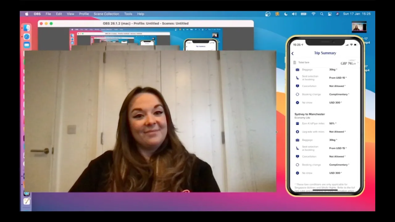
09 - Mid-fidelity Clickthrough
The flow present in this prototype follows a set of determined interactions. Clicking anywhere on the prototype will show interactive elements to advance.
With the prototype functional the next step would be to validate functionality with usability test sessions while observing the outcomes. It is expected that opportunities for improvement will be presented during this stage which will lead to iterations and more testing for the product to be optimised.
Once the product allows users to achieve their intended goals and the success criteria has been met we'd move on to Wireframing.
10 - Wireframes
The wireframes detail the various aspects of the onscreen components, interaction behaviour and state information.
I recognise the importance of providing all the necessary details to avoid ambiguity on the part of developers and working with developers since has empowered me to create designs that are smart and technically feasible.